How to Choose the Best Bathroom Colours
Published: 8th Oct 2025Read Time: 9 min
Share:
The colour you choose is the single most powerful tool for transforming your bathroom. A different shade can change a bathroom entirely, not just by adding a new aesthetic, but by fundamentally altering your perception of the space.
The right bathroom colours can instantly influence mood, and, critically, they can trick the eye into making a tiny, windowless room feel dramatically larger and brighter by reflecting light and creating an illusion of depth.
However, with endless paint chips and tile samples, choosing the perfect palette can be completely overwhelming. Do you play it safe with neutral tones, or make a dramatic statement with something bold? Are you aiming for a classic, timeless look or a sleek, modern design?
Here, The Battroom Showroom offers a comprehensive guide that walks you through the most popular bathroom colour ideas, discusses practical considerations for challenging spaces, and provides the inspiration you need to confidently make the right choice for your personal sanctuary.
Popular Bathroom Colour Themes: Pros, Cons, and Inspiration
Choosing a colour palette sets the entire tone for your bathroom. To help you navigate the options, here is a breakdown of the most popular themes, providing a clear view of the style, benefits, and challenges associated with each.
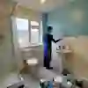
1. Neutrals (Whites, Greys, Creams, Beige)
- Style: Timeless, versatile, and elegant foundation.
- Pros:
Timeless and Versatile: Provides a blank canvas that won't quickly date and pairs well with any accent colour.
Increases Perceived Space: Light neutrals reflect maximum light, making even the smallest bathrooms feel larger, brighter, and more airy.
- Cons:
Can Look Plain: Risk of looking too stark or uninteresting without sufficient texture or metallic accents.
Requires Layering: You must layer different shades (e.g. greige walls with white trim and a cream vanity) to avoid monotony.
- Inspiration: Combine warm neutrals like soft taupe or creamy beige on walls with bright white fixtures. Introduce texture with rattan storage, linen towels, or a wood-effect floor.
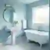
2. Pastels (Soft Blue, Sage Green, Blush Pink)
- Style: Gentle, fresh, and soothing, leaning into a spa-like feel.
- Pros:
Calm and Spa-Like: Muted shades like sage green and serene blue are instantly tranquil, promoting relaxation.
Enhances Light: Works beautifully in bathrooms with ample natural light, maximising a bright, airy feel.
Natural Pairing: Combines perfectly with natural textures like wood and stone.
- Cons:
Can Lack Drama: If a strong visual impact is desired, soft pastels may feel too delicate or 'wishy-washy.'
Risk of Overly Sweet/Retro: Requires care to avoid a dated or 'sickly sweet' look if not properly grounded.
- Inspiration: Pair a dusty pink or soft green with natural wood accents and stone tiles. Use subtle metallic accents like brushed nickel to give the look a contemporary edge.

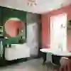
3. Bold Colours (Navy, Emerald Green, Deep Terracotta)
- Style: Dramatic, sophisticated, and full of personality.
- Pros:
Adds Personality and Drama: Perfect for creating a luxurious, custom look; colours like rich navy or emerald green instantly elevate the space.
Great for Focal Points: Ideal for a statement wall, a tiled shower surround, or painting a vanity unit.
- Cons:
Can Overwhelm Small Spaces: Use with caution in windowless or compact bathrooms, as they can feel too intense.
Less Flexible: Harder to change accessories and textiles when the main colour is a distinct, dominant shade.
- Inspiration: Use a deep blue or rich burgundy on a feature wall or on wainscoting. Balance the intensity with crisp white fixtures, bright artwork, and warm metallic accents like gold or brass tapware.
4. Dark and Moody Palettes (Charcoal, Black, Deep Teal)
- Style: Intimate, luxurious, and contemporary.
- Pros:
Luxurious and Contemporary: Deep hues like sleek charcoal or black create a high-end, sophisticated look that transforms the room's mood.
Pairs Nicely with Metallics: The dark backdrop allows finishes like polished chrome, brass, or gold to truly pop and add necessary shimmer.
- Cons:
Needs Careful Lighting: Essential to introduce layers of light (vanity lights, ceiling spots) to prevent the room from feeling cave-like.
Can Feel Heavy: In a large space, using dark colour on all surfaces without contrast can feel too intense.
- Inspiration: Consider dark tiling or paint in a deep teal or black. Contrast with a white marble vanity top and use antique brass or gold fixtures for a touch of glamour.

5. Pantone Colour of the Year
- Concept: Signals a major trend in design, offering a fresh, current starting point.
- Examples:
- Style: Cozy & Grounding—a sophisticated neutral with earthy tones.
- Use: Excellent as a wall colour for a spa-like retreat or on a vanity unit. Pairs well with white, sage green, and brushed bronze metals.
- Style: Soft & Nurturing—a delicate balance of pink and orange.
- Use: Perfect for adding gentle warmth on a single wall, through textiles, or a statement tile. It complements white, light wood, and gold fixtures.
- Inspiration: Use the latest shade for small, non-permanent items like bath mats, towels, and decorative ceramics to keep your bathroom subtly on-trend.
Practical Tips for Choosing a Bathroom Colour
Choosing the right colour palette for your bathroom goes beyond personal preference—it impacts how the room feels, functions, and ages. Use these key questions to guide your decision and ensure a successful outcome:
- How much natural light does your bathroom get?
If you have minimal or no natural light, choose lighter colours (whites, pale pastels) with a higher sheen (satin, semi-gloss) to maximise light reflection and prevent the space from feeling cave-like.
If you have abundant natural light, you have the freedom to use deeper, richer colours (navys, emeralds) without sacrificing brightness.
- Do you want your bathroom to feel larger or cosier?
Larger/Airy: Stick to lighter, cool colours (soft blues, whites, light greys) which reflect light and psychologically push the walls away.
Cosier/More Intimate: Embrace warmer, darker shades (deep teals, charcoal, rich greens) which absorb light and create a cocooning, luxurious feel.
- Are you aiming for a timeless look or something trend-led?
Timeless: Use classic neutrals (white, beige, light grey) as the foundation for walls and fixed elements (tiles, vanity). You can then introduce colour via easily replaceable accessories (towels, artwork).
Trend-Led: Go bold with the colour of the year (like a deep terracotta or soft peach) on a statement wall or a painted vanity, keeping permanent fixtures neutral to minimise future renovation costs.
- How much are you willing to commit? (Paint vs. Fixed Elements)
Low Commitment (Quick Refresh): Use paint, towels, and shower curtains to introduce colour. These are cheap and easy to change in a weekend.
High Commitment (Full Refit): Choose colour for tiles or permanent cabinetry (vanity). These are expensive to change, so choose colours you are confident you'll love for five to ten years.
- How will colour interact with any existing fixtures/furniture?
Always consider the undertones of your existing elements:
Does your tiling have a warm (yellow/cream) or cool (blue/grey) undertone?
Does your metalware (taps/fixtures) use warm metals (brass/gold) or cool metals (chrome/brushed nickel)?
Ensure your new wall colour harmonises with these fixed tones to create a cohesive design.
- Is this part of a full refit or a quick refresh?
Full Refit: You have total control. Start with a colour palette and then select tiles, vanity, and paint to match.
Quick Refresh: Use colour strategically to distract from or update existing elements. For example, a deep, rich paint colour can make an older white vanity look crisper and more modern by contrast.
The Power of Colour in Your Bathroom Sanctuary
Ultimately, your bathroom colour choice should achieve functionality and emotion. So, choosing the right hue for your bathroom is an important decision you’ll make in defining its aesthetic and atmosphere. It's not just about decoration; it's about strategic design that tackles the challenges of humidity, light, and small square footage.
This guide has demonstrated that every palette, from the timeless versatility of Neutrals to the dramatic intimacy of Dark Palettes, comes with its own set of benefits and requirements. By applying the practical questions outlined, factoring in natural light, desired mood, and commitment level, you can confidently filter the endless options down to the perfect shade.
For further help with choosing the best designs, book an appointment with The Bathroom Showroom. Experts in all things bathrooms, we can help turn your dream bathroom into a reality.